UK regional economic data: what’s brilliant, what’s not
I want to do a couple of things in this post:
- Write a little love letter to one of my favourite little-but-big datasets, the ONS region-by-industry GVA excel sheet, and give some simple ways to examine it using R (including an easy way to use R in the browser).
- Also talk about what I think is missing / weird / eccentric about this data (and the UK’s regional economic data generally), as well as some of the many things I still don’t fully understand.
The lovely data
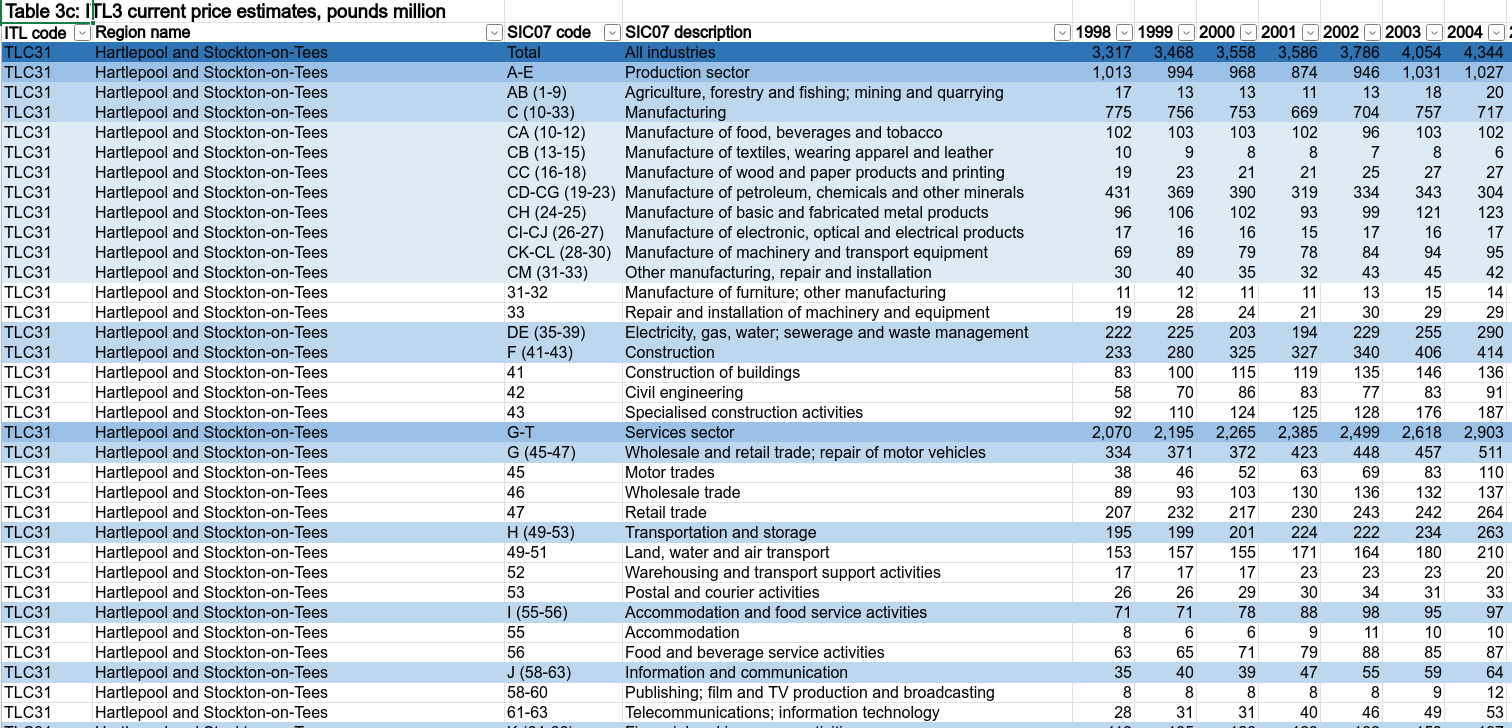
For every year back to 1998, we’ve got economic output down to ITL3 geography (i.e. most of the larger local authorities), for a range of up to 45 sectors (sector counts drop for smaller geographies).
in real/inflation-adjusted (‘chained volume’) and money-values-at-the-time (‘current prices’).
What things to I think are missing / weird?
BITS
We already have incredible data. The issue is finding ways to make it talk. (That’s not to say we don’t need more and better data, see below…)
Example: regional sector output from the ONS. I’ve used a bunch of different data sources in my time with SYMCA so far, but this is the one I’ve returned to the most. (Their original data; my nice machine-readable / combined-with-job-data version.) It’s the entire UK spatial economy squeezed into a tiny set of numbers. It allows you to see granular economic history going back to 1998, see huge structural shifts. You can see where we’ve come from - absolutely essential for figuring out where we’re heading.
It’s not the kind of dataset that makes people swoon, the opposite of Big Data (do we still talk about that any more?), nothing to do with AI. It’s just a high-concentrate distillation of economic goodness in a tiny package. I keep on finding new things in there it can show us all the time (and sometimes things in there that suggest it’s a little bit eccentric).
(Yes, regional GVA numbers need slathering in caveats — I’ll do that another time, though the ONS explain how the sausage is made here and how much is “observed vs estimated vs modelled” here. And I’m just reading Diane Coyle’s latest book where she is very affectionately working up to suggesting national accounts need euthenising…)
All that awesomeness is hidden in an excel document. ONS have their own analysis (latest here) with some nice findings and interactives. But it isn’t easy to ask deeper questions about your own region or place it in historical/spatial context. Through my experience of trying to do that for SYMCA, I’ve built a range of ways to see what’s in that excel document — and through that process, I’ve come to think we should be able to build better shared tools. Everyone’s asking broadly the same questions, after all — there’s a tonne of wheel-reinvention going on to extract the answers.
This is in no way meant as a criticism of ONS, who are doing incredible work getting this data to us and, through ONS Local, supporting regional policymakers. I went on ad nauseum about the “huge value and power” of ONS data at their regional data conference last November.
If you’re interested in the nuts and bolts, [this post] runs through some R code to illustrate the point — a pipeline direct from that opaque excel file through to insights in straightforward, reproducible steps. Using the same pipeline, and all in code, we can build reports, maps, dashboards etc. and share them easily. Once we have that, we can puzzle our way to what it means for our regions, what theories of change we believe it supports, what blindspots and problems the data has — but a data platform like this underpinning it smooths the path considerably.
More recently, I’ve been re-using these tools to help other Yorkshire government bodies get insights quickly. This came about quite serendipitously, but it’s helped convince me it’s a good way to work. [Explain something about how much it speeds things up / how cost effective it is]
(This is all on my github where I’m trying to corral more of it into the regecontools site, itself a github repo; the website’s all generated using R.)
I’m not suggesting how I’ve approached this is anything like the best way - but I am arguing that building these pipelines openly leads to good things that otherwise couldn’t happen. What I’d love to see is what others can do, and what kind of tools we could build together.
And then something on: why the orig data sources are not enough. Just supplying openly isn’t enough. Without capacity to see what’s in that data, you’re still blind. What exactly does that capacity look like and how do we build it?
CUTTINZ
Fundamental difference between national and regional. Example: I’ve seen central government supply pretty solid economic analysis… etc